(Journal)
Why the stoneware studio kept its old logo
The client asked for a new logo. We ended up keeping the old one, and the identity is better for it.
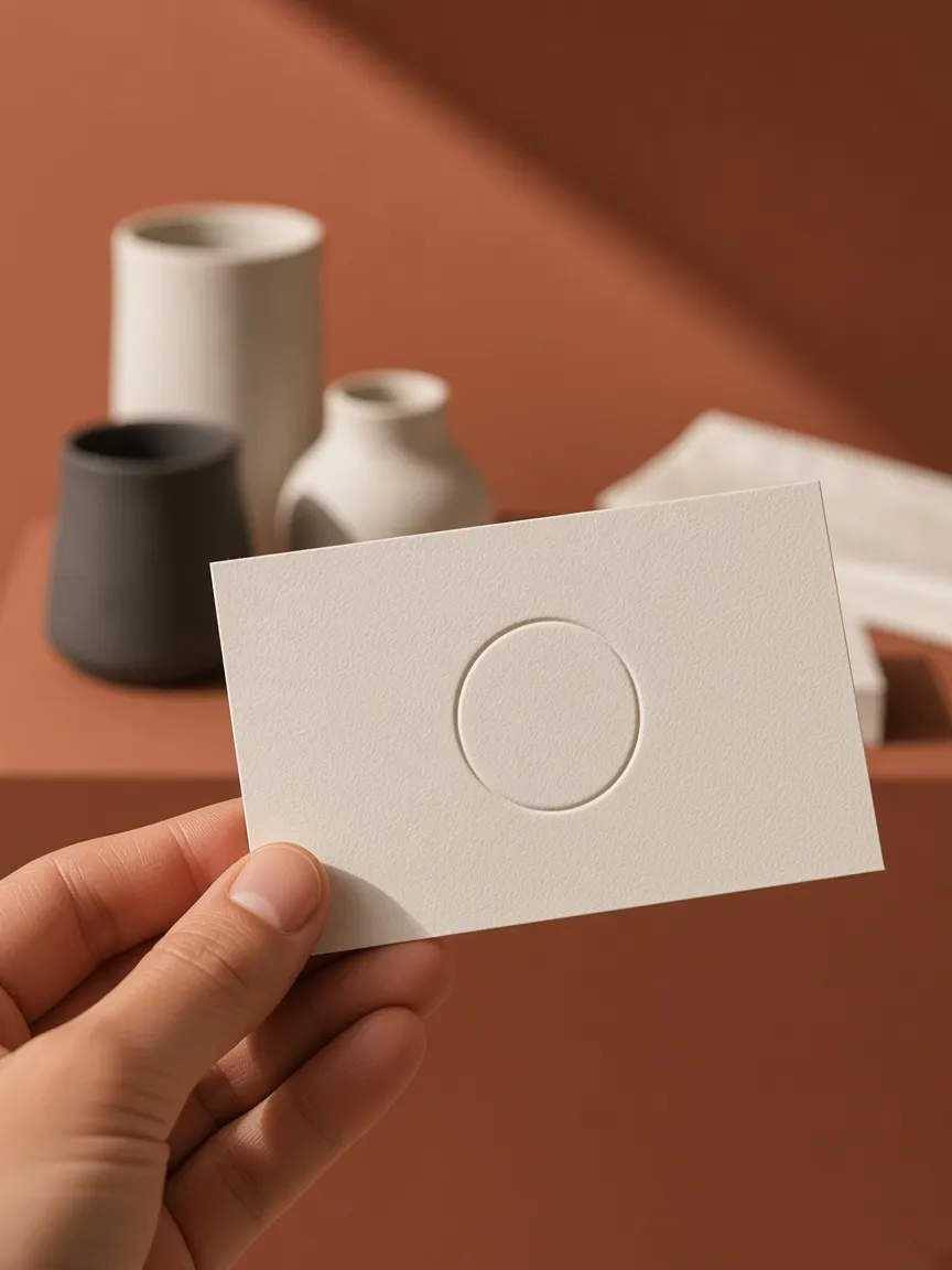
The brief said “new logo”. The first week of research said otherwise. Customers at the shop, the potters’ neighbours and even the local paper all described the studio by its little hand-drawn circle, the one on the kiln door since the garage days.
Recognition is expensive
A small business spends years earning the few seconds of recognition a mark gets on a shelf or a market stall. Throwing that away for something cleaner is a real cost, and it rarely shows up in a proposal.
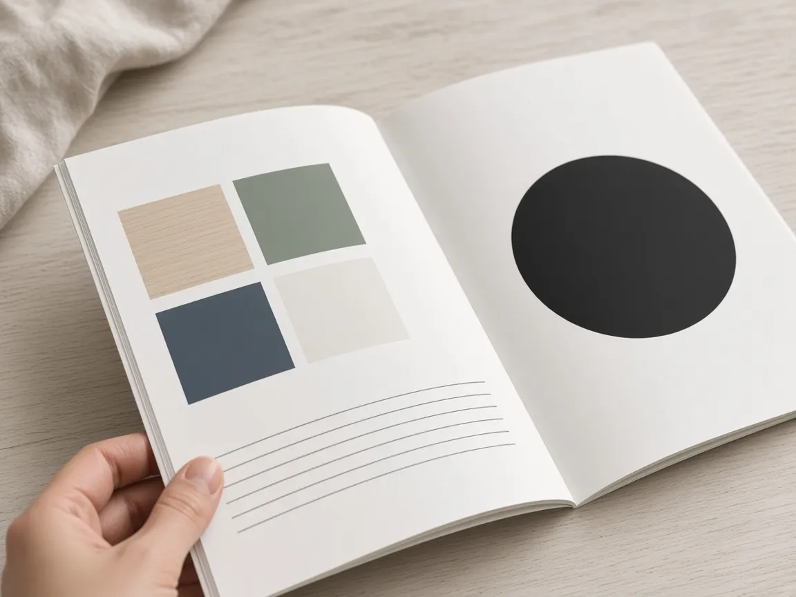
So instead of replacing the circle, we redrew it. Same idea, steadier line, a single weight that survives a rubber stamp and a debossing plate. Regulars noticed that something looked sharper. Nobody noticed that it had changed.
Where the work went instead
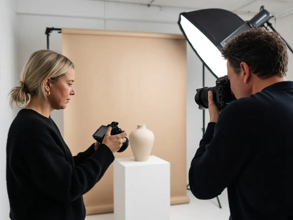
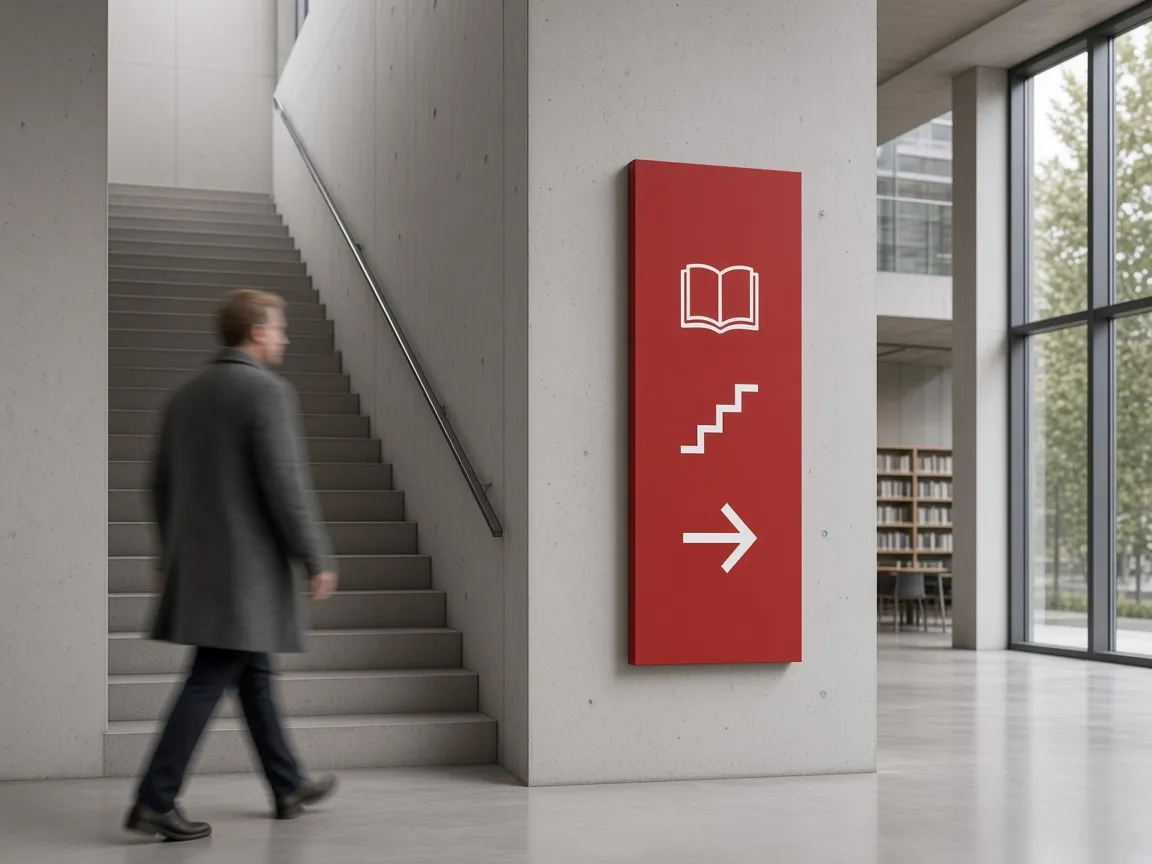
With the mark settled, the budget went into the things that were actually broken: the packaging, the paper stocks, the shop signage and a photo style the owners could shoot on their own phone.
The best identity work is sometimes deciding what not to touch.
The owners were nervous about paying for a logo they already had. Six months later, they say it was the easiest decision of the project.