(Journal)
Designing signs for people in a hurry
Notes from the library wayfinding project: nobody reads a sign, they glance at it. Design for the glance.
- Written
- Reading
- 1 min read
- Topics
- wayfindingprocess
We spent the first week of the library project watching people. Not asking them anything, just watching where they stopped, where they looked and where they gave up and asked the help desk.
People glance, they do not read
Most people looked at a sign for less than a second. In that time they took in a colour, a shape and maybe one word. Anything more was decoration.
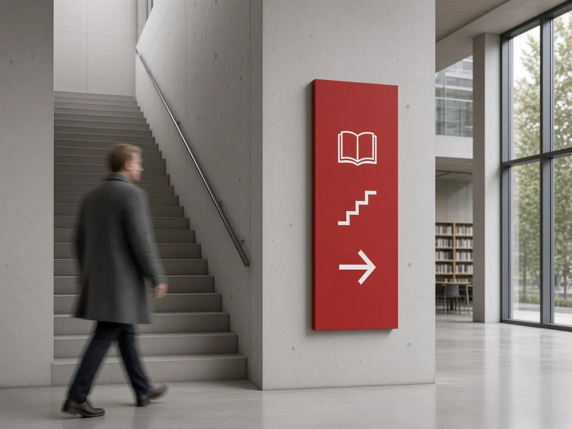
So the system became one red, one arrow and twelve pictograms. Words are kept for room names, and only where a pictogram would be a guess.
Put signs where people decide
The architect had left beautiful spaces for signs on long empty walls. People never stopped there. They stopped at the top of stairs, at lift doors and at the point where a corridor splits.
Every totem moved to one of those spots. It made the plans look messier and the building much easier to use, which is the right trade every time.