(Brand identity)
Identity for a stoneware studio
A quiet mark and a warm palette for a two-person pottery that sells from its own shop floor.
- Client
- A stoneware studio
- Location
- Bergen, Norway
- Year
- 2026
- Services
- Identity, Print, Packaging
(Overview)
The brief
The studio had grown from a garage kiln into a shop with a waiting list, but its look was still a borrowed script font and a phone photo. The owners wanted something as calm as the pots, and nothing that would date in five years.
The work
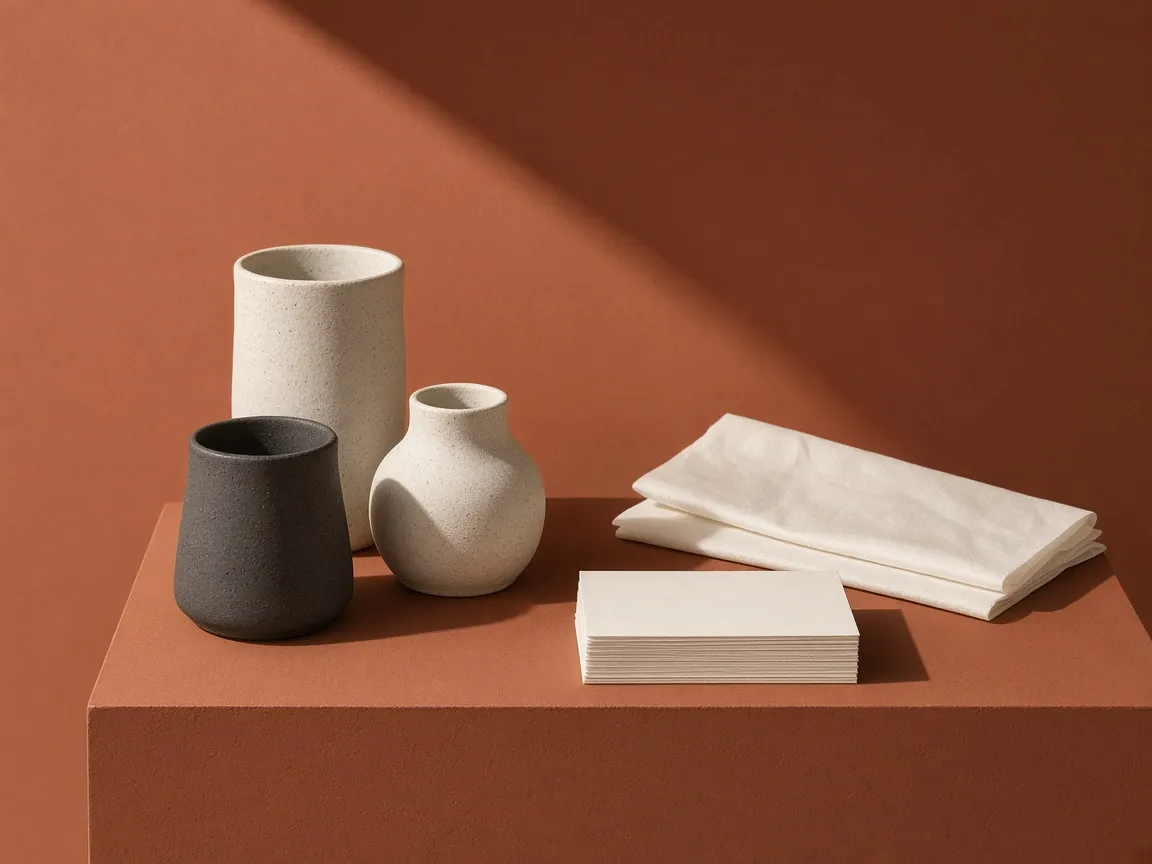
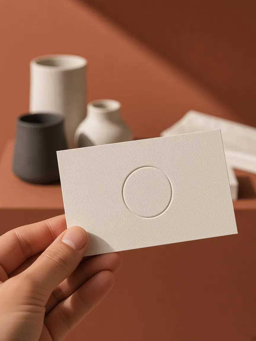
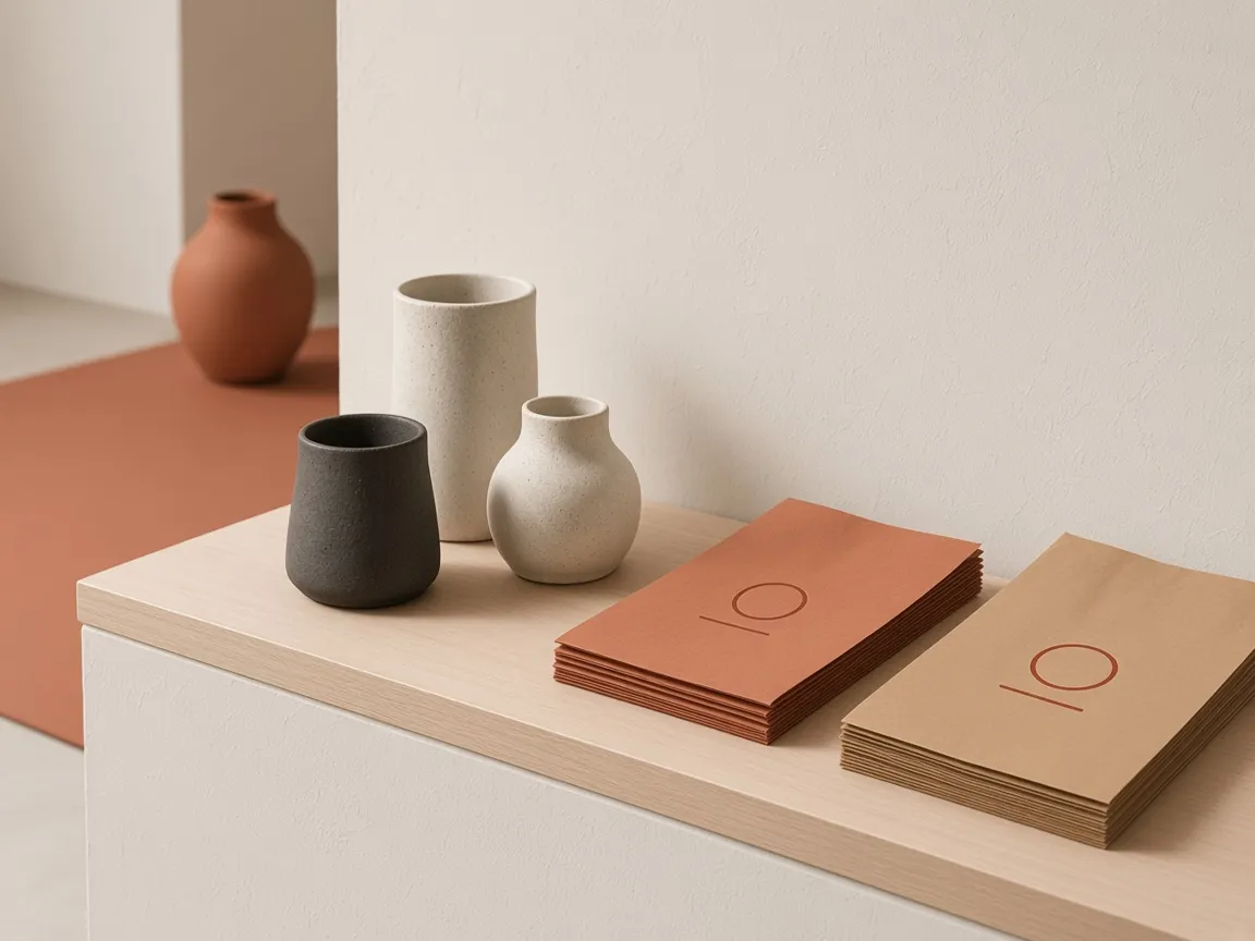
The mark is a circle cut by a single line: the wheel and the wire used to lift a pot from it. It is debossed rather than printed wherever possible, so it reads as a texture before it reads as a logo. The palette comes straight from the clay body, with terracotta for wrapping and a charcoal for type.
The result
Everything the studio prints now fits on two paper stocks and one stamp. The owners wrap orders themselves in under a minute, and the shop has not needed a new sign since it opened.
(Next project)
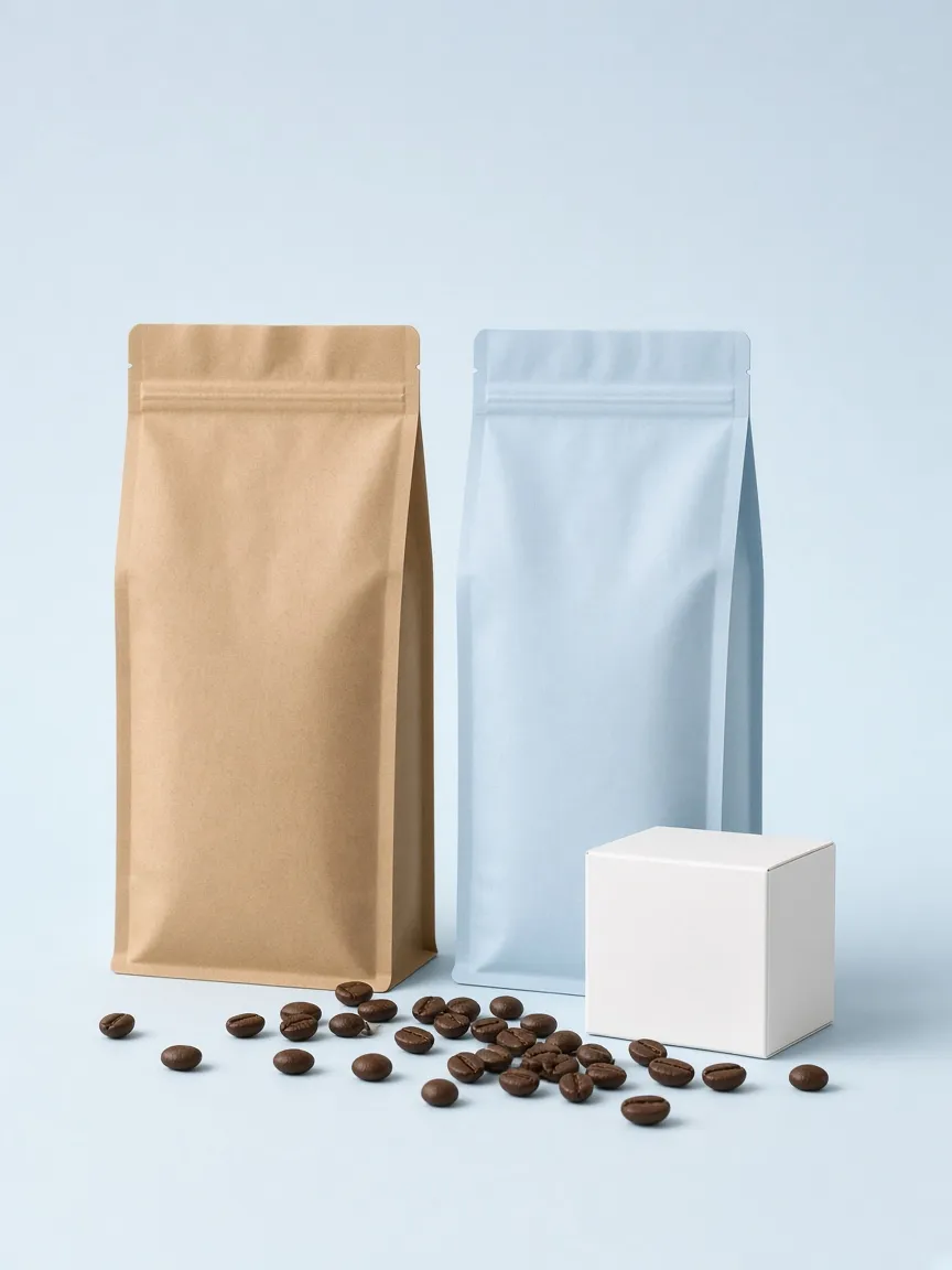
All workPackaging for a coffee roaster
Packaging, 2025