(Journal)
Three type pairings for small food brands
Food packaging needs type that feels warm up close and still reads from across a shop. Three pairings that do both.
- Written
- Reading
- 1 min read
- Topics
- typography
Small food brands live on crowded shelves. The type has to feel handmade enough to be trusted and clear enough to be found. After a dozen packaging projects, I keep coming back to three approaches.
One grotesque, two weights
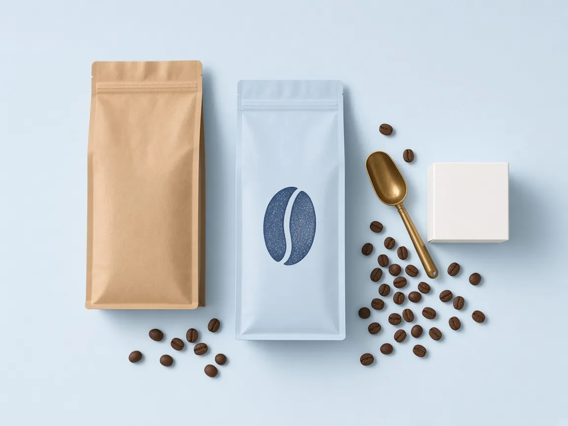
The safest and often the best. A single sans serif in a regular and a medium weight, set large for the name and small for everything else. It is what we used for the coffee roaster, and it lets the colour of the bag do the talking.
A serif name, a sans for the facts
A warm serif for the product name, a plain sans for ingredients and weights. The contrast tells people which line to read first, which matters more on a jar than anywhere else.
A monoline for the story
For brands with a strong founder story, a humanist sans with a slight irregularity can carry the tone on its own. Use it sparingly: on the front, never in the nutrition table.
Whatever you choose, print it at actual size and put it on a real shelf before anyone signs off. Type that looks calm on a screen often disappears in a shop.